Monday, February 28, 2011

Unsung Heroes Final Project: Tesla and Marconi


What made you choose your particular unsung hero?
For my portion of the project, I chose Nikola Tesla as my unsung hero. The reason behind this choice was that I have heard about Tesla only in minute stories and articles, and wanted to learn more about why he is not as acclaimed as other inventors such as Thomas Edison.

Did you learn anything new about the person that you chose?
Through researching Tesla's life story, I learned a great deal of new things about this great inventor. First and foremost, he is not credited or publicized (or was not, as credit would have been more useful to him while he was alive) for many of his inventions, namely the radio and quite frankly, robotics as a science. While Tesla had secured patents for the early radio designs, a different inventor (none other than Gugliemo Marconi actually) was later transferred the patent ownership due to high-powered political connections. Additionally, he actually created the first practical R/C robot for an electrical convention in 1898, in the form of a boat. He is not currently publicized as the father of the radio or of the study of robotics, but history has shown these claims to be true.

Source: http://www.pbs.org/tesla/index.html

Do you think that your design clearly and accurately represented your hero?
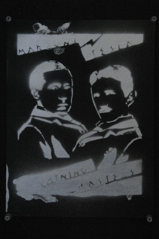
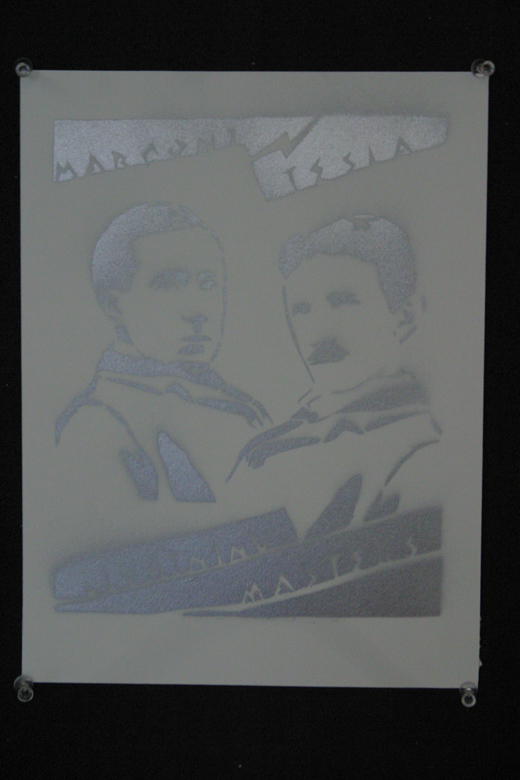
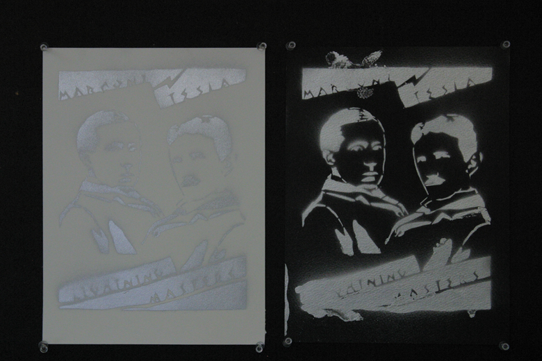
I believe that the design does, in fact, represent our hero accurately, as historical photos were used as reference material. The clarity of the image is pristine, as when we compared the original photos to the stencil design, the resemblance was uncanny.

Would you do anything different?
If given another shot at this project, I would try and take the time to make this design into a silkscreen rather than a stencil, as my original design would be better conveyed thorugh using photo emulsion on a silkscreen rather than its present "stencil-ized" format.

What traditional and technological art-making techniques did you use in your design?

 First, I used a photographic reference and produced a rough sketch of the two heroes on Adobe Photoshop, using mainly the pen tool. After I was remotely satisfyed with the design, I transferred the file to Adobe Illustrator, where I refined the line qualities and made the design look more aesthetically pleasing. When all of the computerized edits were done, the design was printed and cut out. While the original plan was to silkscreen the design, due to time constrains, we resorted to just use the design as a stencil and used spray paint as our medium of choice. Our final product came out as two "posters," one on black spongy presentation board, and the other on white cardstock.
Here are pictures of the design and final products...enjoy.


Tuesday, January 25, 2011

Unsung Heroes Project

1. My five potential people/groups for this project are:
  • Nikola Tesla - inventor and competitor of Thomas Edison, a great scientist whose level of fame I wish to one day reach.
  • My mother, father, and little brother - for making the the person I am today (mainly with respects to academic, quirkyness, and argumentative skills)
  • My grandparents - to taking care of me during those long summer days in my youth, subtly teaching me lessons in patience (through fishing) and craftiness (through
  • Ishiroh Honda - director of the first Godzilla movies, of which I am a long-time fan
  • Patek Philippe & Co. - the company credited with making the first wristwatch, my personal appearance wouln't be complete without my cherished wristwatches
2. Nikola Tesla,

The mediums which I would like to utilize for this project are:
  • Printmaking/Silkscreening - Materials: screen, squeegee, screen printing ink, paper/poster/printing surface, and, if possible, emulsion and transparencies
  • Flipbook - Materials: photoshop or illustrator, pencils/pens and paper, image scanner, and printing paper
For my group's (me and aaron) final product, we will probably be producing (though photoshop) silkscreen designs of two (Tesla and Marconi) of our unsung heroes (either individual or group shots...). We will attempt to successfully apply emulson to oursilkscreen to accurately imprint our design(s) on our screens. We will also try to incorporate lights and sounds into our final piece. A final video will be produced to present on our blogs.

Friday, January 14, 2011

Five blogs I like

Kotaku
This blog dicusses popular videogame culture and news. I love video games and reading about random stories concerning them. Kotaku offers me just that, all of the news on developments and reviews of games that I could ever want. The visual design of the site is quite simple; each post has a quick blurb about its story (occasionally with a picture from within the post), and the header is eaily identifyable. However, the yellow column fromt eh left sidebar tracks all the way down the page, though it does help in htat the rest of the page is dominated by a dull white color. Additionally, the number of posts on the page is quite high (though I guess it is balanced by the short length of the condensed posts).

Gizmodo
This is a super tech-based blog. It is very similar to Kotaku in that it provides news and stories on the technological world (as it does overlap with the world of videogames...) The design is very similar, albeit with a light blue, Intel-esque colors instead of a bright yellow... However, Gizmodo has the added disadvantage of being overtaken by ads (moving, rather annoying ones at the moment), but besides this, the blog delivers exactly what it promises, enws on gizmos.
Matt & Kim
This blog has all of the information and news that I need concernign one of my favorite musical artists, Matt & Kim. What I like about their blog is that it contains EVERYTHING about them, from tour/condert dates and locations, to lyrics, to merchandise and more... However, one large drawback is that the site takes a...long...time...to...load. The color scheme is just what you would expect from them, as the themes of their pages are crafted in the style of their album covers (rather pop art-ish...)

/Film
This blog supplies a reader with reviews and news concerning the culture of movies and film. The format of the blog is quite informative and aesthetically pleasing, with a rather large picture and first few paragraphs of text within each post. This (quite large) amount of information is coupled with a 10-post limit per page, pretty nifty for saving your eyeballs from an immense amount of information... Other than that, the web page offers simple, but effective design in that the color schemes are not "loud" or overtly distracting.

Neatorama
This blog is a bunch of quirky things and tidbits of knowledge that would otherwise be out-of-place. I enjoy its simplicity, with its header on the top, and the rest of the page a blank white....leaving the reader to focus on the oddness of the posts. However, the only division between posts is a colored header (black vs. blue text), which isn't much larger than the regular text, thus it can be hard to differentiate posts if skimming the whole page.

It should be noted that the stories posted on the blog are not always mutually exclusive, as the same/similar stories were seen on Kotaku, Gizmodo, and Neatorama...